
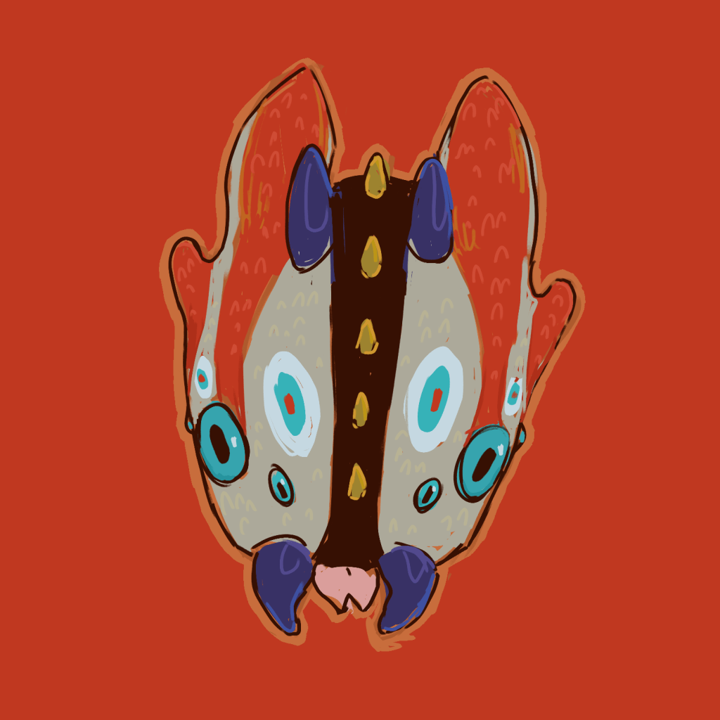
In preparation for artfight, I made a ref sheet for Silly, one of my creature characters.
I originally got this character as a part of an art trade, so the initial design was not my own. The image I received was below.

When I first got the character, I made some loose doodles, but kept encountering flaws with the design that bugged me personally. Specifically, there was a shade of brown used on the bottom leg stripe that appeared nowhere else on the character, and the body brown and leg white were exceedingly dark and light which made the design lack cohesion.


When it was finally time to create a reference sheet, I wanted to fix those two browns, add detail to the torso to break up such a large swathe of solid color, get rid of the unnecessary middle brown, or at least make it make more sense, and overall make the design more cohesive.
I ended up creating a warmer mid-brown to replace the previous one, and applied it to the underbelly, with a red racing stripe to create a through line between the head fins and tail bulb.
I also got rid of the white and replaced it with the existing tan. This removed the white ring around the false eyes on the face, which made them match the ones on the wings and tail fins. I also placed another false eye on the chest.
I recolored the bands on the arms and legs – I debated using one of the brighter colors there as well, specifically the red, and tried pairing it with the yellow or the green, but one read a bit excessively colorful and bright, and the other leant Christmas, and not in a good way. The more neutral brown looked the best.
The end design had one less color, and the colors were better applied and more cohesive. The design is more consistent and balanced, and I am overall very happy with it.


Of course I had already created my icon for the character for Artfight and used it in my card so I had to redo that, but my files were organized enough that I just had to tweak one layer which took less than 5 minutes to create and replace.
Thank you to my friend Mango Diaczynsky (mangopoli on Artfight) for their help with deciding on color placement – it was really helpful to have a second set of eyes on this project.