
I was given the task of a total rebrand for the Philadelphia Magic Gardens on South Street. I first visited the location to get an idea of their visual presence.
Because the project was based on the work of an existing artist – Isaiah Zagar – I wanted to make sure my work was true to his visual style. Some keywords I came up with to guide my work were;
Asymmetric, Organic, Eclectic, Cluttered, Dense
I wanted to make sure there were no true right angles in my work. Zagar made heavy use of stained glass, colored light, found objects, positive and negative space allowing for airflow, bike wheels, found folk art, broken plates, and of course lots of tile.
One of the things I wanted to focus on was the presence of grout throughout the entire location. This is the unifying characteristic of all his work, and it provides a near uniform color to ground the location. I used this neutral beige color across my design to serve a similar purpose.
I used a reference image I took at the location as a reference for a series of studies to identify color and shape. I then created a tiled color palette guide that I used as a reference when working on the rest of the project.
I knew I wanted a font with some unique bubbly-ness, with no sharp angles, and an interesting silhouette, but I went through a few options before I settled on making my type completely from scratch.


The first real application of these design characteristics was a poster. One piece I made use of was a color gradient including everything from my palette. I also used the same jagged forms with rounded edges with my grout color.
I decided to create a human form surrounded by other body parts mirroring a common motif among Zagar’s work. The hand motif appeared later in the web design as well.


I then started looking at more practical applications of these design characteristics. While these explorations did not lead to any deliverables themselves, they helped me identify what visual elements I wanted to use moving forward, and were ultimately some of the most useful and impactful things I made.
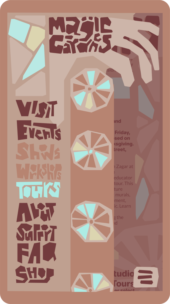
I used the bike wheel I created for the poster design, and created a new hand for the cascading effect. This is also where I first started creating my custom type, which I ended up using heavily throughout my web design.
The secondary font I used was Jellee because of its rounded edges and overall form.

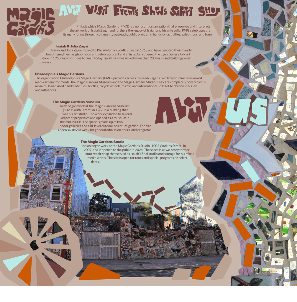
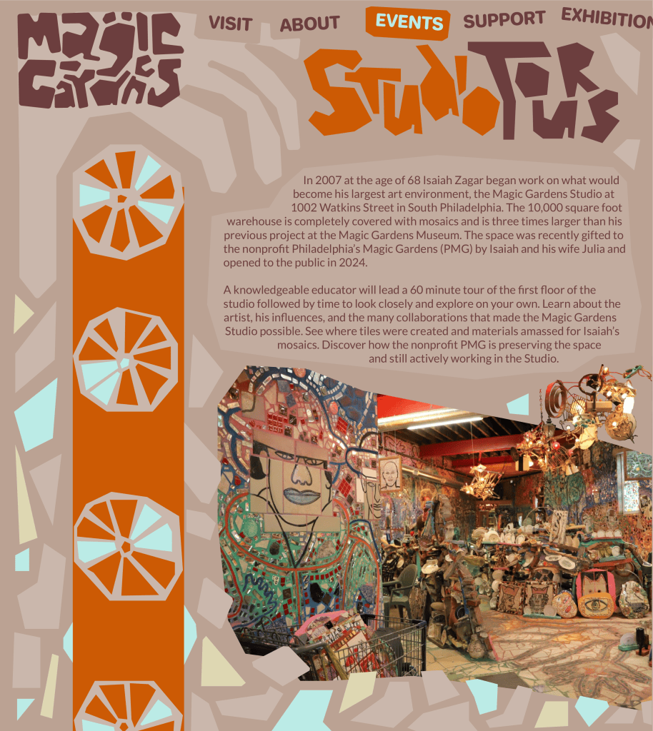
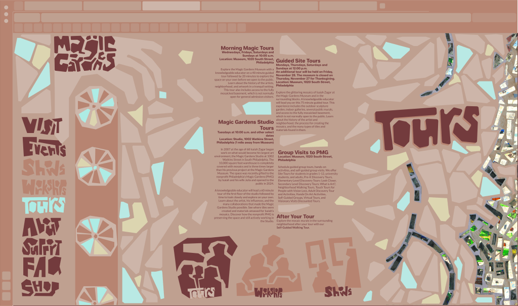
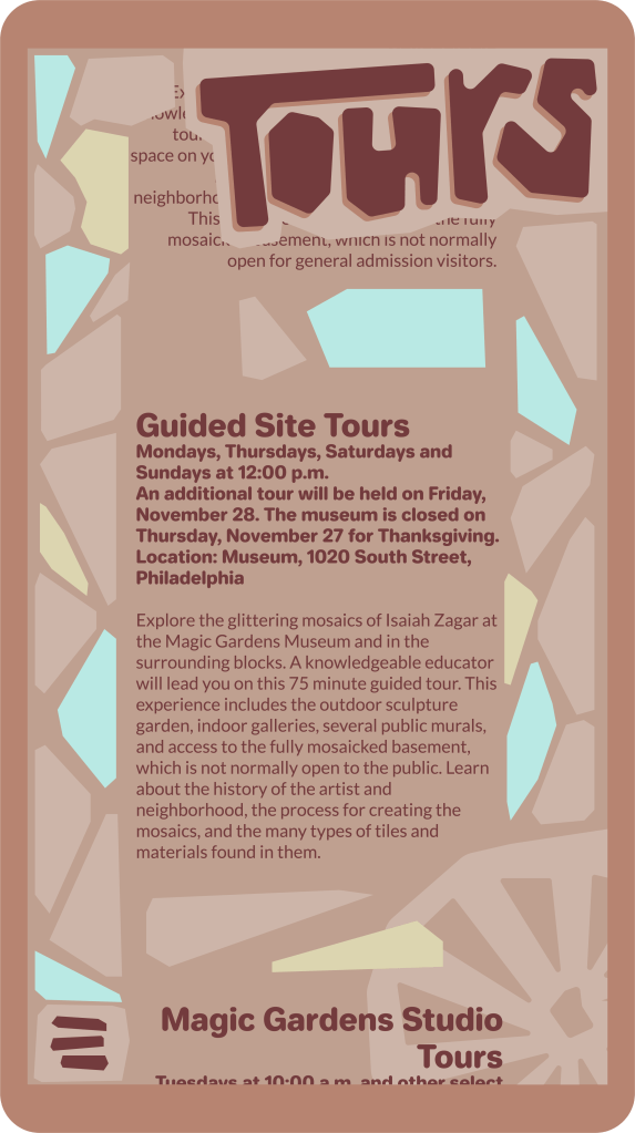
I applied the principles I established in my earlier studies to web design, though I leaned further away from the orange that had dominated them in favor of a more neutral palette. I wanted the images themselves to stand out more when they were applied. I used a broken tile form to create breaks in the text when scrolling, and to distinguish between sections. I also created some visual icons for different pages.


I applied many of these same principles to merch. I wanted to avoid slapping a logo on a t-shirt, but instead wanted to create pieces that individuals would want to wear, and that would push the brand’s overall identity and provide organic advertising. Designs used assets from previous applications almost exclusively.


Finally I looked at some paper applications. I graphically treated an image of tile work from the Gardens to make it match with the branding and color palette of the rest of the project, and applied the same assets to a wristband that would serve as a ticket. I wanted every piece to stand alone as a piece of art rather than pure ephemera.


Below I have a series of assets I created for the brand, some used above, and some not.


Finally I have my pitch deck for the project if you are interested in looking at it all back-to-back.